Low-Poly Environments and Pixel Art Textures
We’ve learnt that the process of level design is exciting, messy, iterative and ultimately very rewarding.
After plunging straight into creating the playable areas for Shelf Life, our goal has been to achieve a look that is particularly nostalgic for many members of our team, a sort of hybrid of blocky 3D low-poly environments inhabited by 2D sprites.
While we have been looking at 3D and 2D games for inspiration, our style is more minimal than many of the games we are inspired by (late Sony PSX era games) such as Breath of Fire 4 and Grandia. Many of these low poly / pixel hybrid games tend to favour more ‘blurry’ textures on their polygons which emulate a ‘realistic’ look, but we’ve opted for a simpler, more limited palette with our 3D objects being quite bold and basic (and cute!) which follows true more to games like Earthbound and Pokemon.
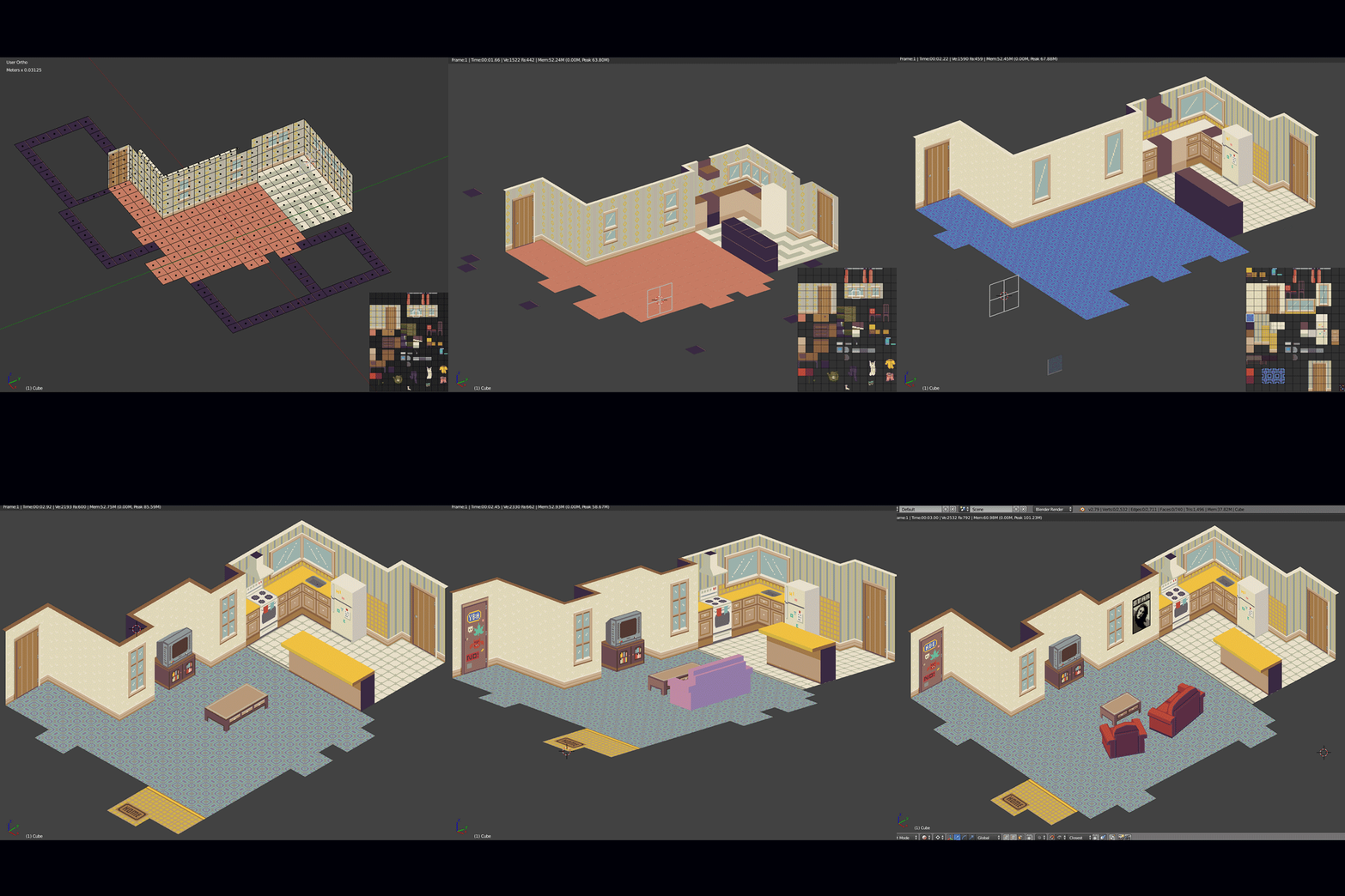
Here are two examples to provide a general idea of what our process looks like:
Above we’ve got the living room & kitchen area for the playable character’s shared rental apartment, and below you can see the process and final(ish) version of one of the bedrooms of this student rental, belonging to the character ‘Robbie’.
We definitely find that we go through several stages of placing objects and colours to get a cohesive layout. Thankfully using add-ons like Sprytile and Apps like Aseprite make the work flow in Blender really straightforward.
Our style will keep evolving as we go forward, but we can definitely recommend low-poly 3D with pixel art textures (or any minimal, stylised look) for other beginner Game Developers who want to create something unique while they are still learning the ropes.
Cheers,
-Fnife Games


